
Context
ClickFunnels is a SaaS platform that enables entrepreneurs and businesses to build sales funnels, sell digital products, courses, memberships, and physical goods online. At the time of this project, the platform had over 100,000 active customers.
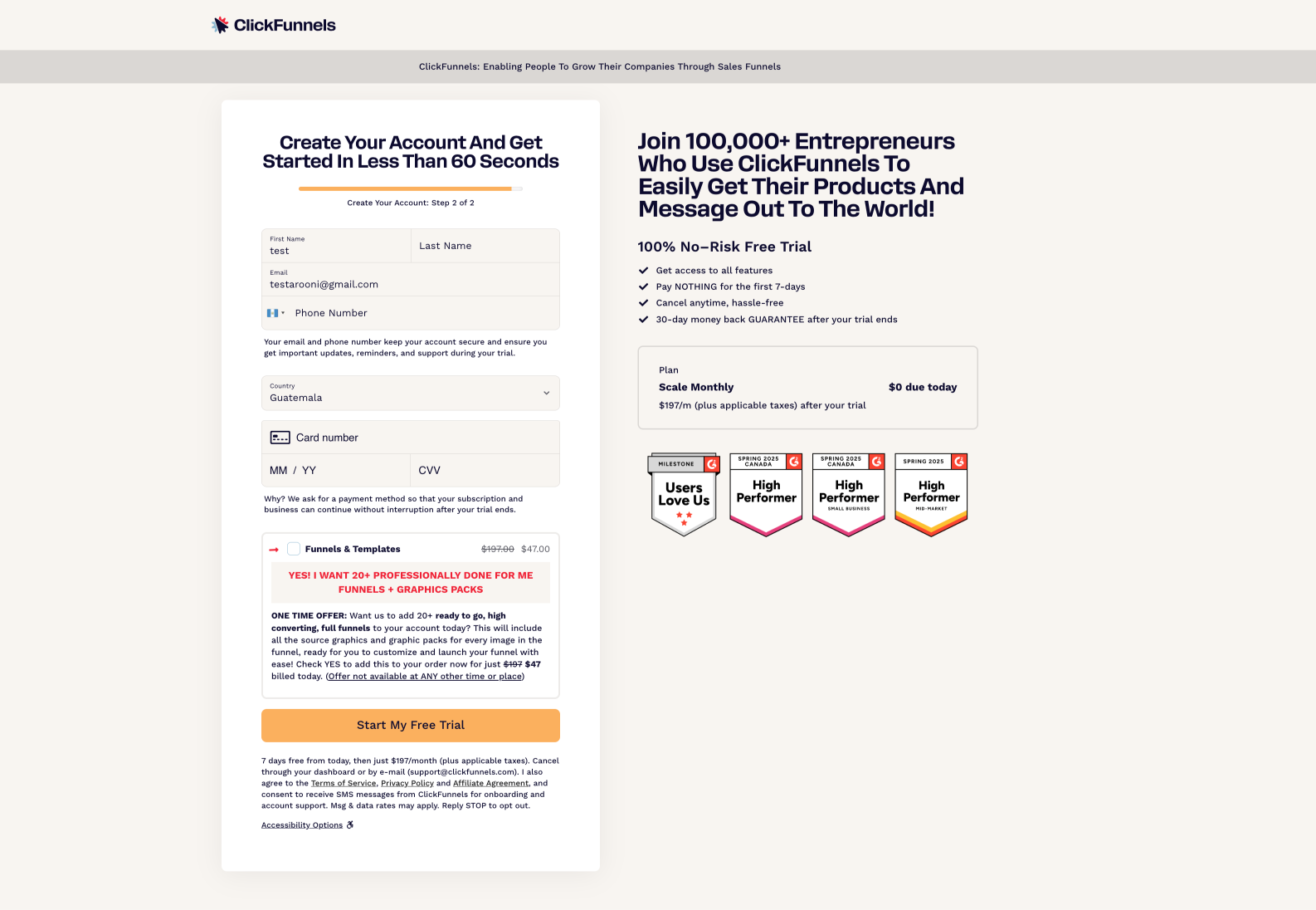
The checkout page was the single entry point for all new trial signups. It received approximately 7,500 page views per week from a mix of traffic sources: cold traffic from paid ads, warm traffic from webinars and email campaigns, and hot traffic from affiliates. The trial was a 7-day free trial with a credit card required upfront, converting to $197/month after the trial period.
Team & Structure
- Product Designer (me): Owned research, analysis, design, and weekly recommendations
- Chief of Staff: Sponsored the project and facilitated stakeholder alignment
- Engineer (1): Responsible for implementing weekly changes
- Marketing: Involved in weekly meetings, owned copy and ongoing A/B testing post-handoff
The project ran as a six-week sprint with a weekly cadence: meet on Monday to review the previous week's results, agree on what to ship next, engineer builds and deploys mid-week, measure against baseline through the following week.
Problem
The checkout page had an average completion rate of 23.4%. Industry benchmarks for SaaS signup form completion sit around 36% (Heap, 2017 study of 79 SaaS companies), meaning we were significantly underperforming.
Important note on measurement
The 23.4% is an average figure. The actual completion rate fluctuated depending on the traffic source. Paid cold traffic converted lower, affiliate warm traffic converted higher, and marketing campaigns created temporary spikes. To account for this, all measurement throughout the project was done against the established baseline, never raw week-over-week comparison. This ensured we were measuring the true impact of our changes rather than traffic variability.
Research & Discovery
To get a complete picture of where the checkout was failing, I ran three streams of research in parallel during week 1:
Segmented the checkout data by device and customer type to find the worst-performing slices.
Five moderated usability interviews where customers walked through the checkout while thinking out loud, plus reviewing session recordings of real users on the checkout page.
A heuristic review of the current checkout state, benchmarked against established patterns (notably Stripe's checkout).
Each stream surfaced issues the others couldn't, and together they pointed at the changes that drove the biggest gains later in the sprint.
Quantitative Segmentation
I segmented the checkout data into four groups based on device and customer type:
30.8%
Highest completion
21.3%
Second lowest
26.4%
Second highest
15.1%
Lowest completion
"Returning customer" was defined as a user whose email address was associated with a previous purchase from ClickFunnels.
Key finding: Returning customers converted worse than new visitors. This was counterintuitive. People who already knew and trusted the product were completing the checkout at a lower rate than first-time visitors. This signaled a structural issue specific to the returning customer experience.
I pulled session recordings filtered to returning customers and identified the cause: they were routed through a two-factor authentication flow that triggered an auto-checkout process instead of the standard card-entry form. The flow was meant to streamline the experience for known users but was actually creating friction, especially on mobile, where the 2FA interruption pushed people to abandon.
UX Audit
I benchmarked the existing checkout against best practices, particularly Stripe's checkout patterns, and identified multiple friction points:

No prefill
Name and email weren't carried forward from the previous page, even though every visitor reached the checkout already having entered them.
Separate labels
We were using separate labels stacked above each input, which made the form really long and not friendly on mobile.

No color contrast on inputs
Field backgrounds matched the page surface, leaving inputs visually flat and labels stacked above each one consuming vertical space on mobile.

Unnecessary headers and dividers
Section headers added clutter without aiding navigation in a short, single-purpose form.
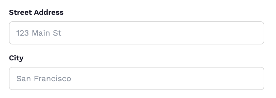
Full address required
Street, city, and state were required even though only billing country and postal code were needed for a digital product.

Country dropdown
Country didn't use IP geolocation to auto-fill, and had no fallback to United States, the majority market.
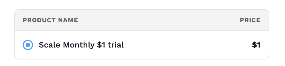
Unnecessary product selector
A product selector sat at the top of the form even though there was only one product available. Pure cognitive overhead.

Disabled submit
The submit button was disabled until every field was complete, with no feedback that this was the reason.
Usability Testing (5 Participants)
Despite pushback on the cost of formal usability testing, I reached out to customers directly and conducted five moderated sessions where participants walked through the checkout flow while speaking their thoughts aloud.
I mapped each stage of the checkout to the user's mental model, noting their expectations, feelings, thoughts, and anxiety points at every step.
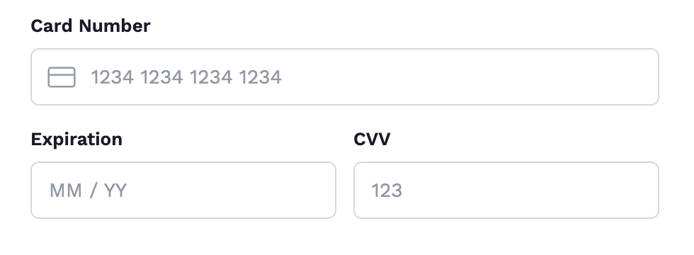
On the card requirement
“Why do I need to enter my card for a free trial? Are they going to charge me?”
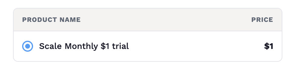
On the product selector
“I'm only buying one product, why is there a selector?”
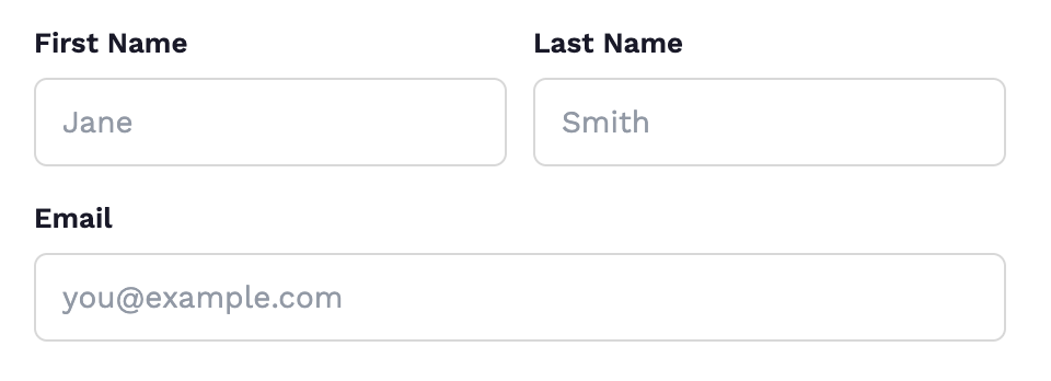
On prefill
“I already entered my email to get here. Why am I typing it again?”
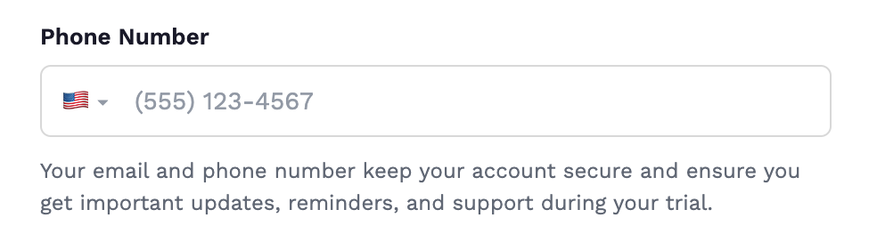
On the phone field
“Why do they need my phone number for a free trial?”

On the disabled button
“I keep clicking the button but nothing happens. What's missing?”
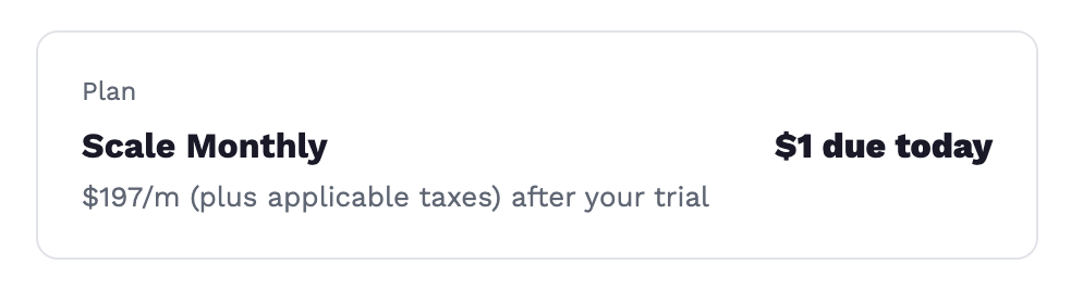
On the $1 charge
“Why do I have to pay one dollar for a trial? And why is my credit card information needed?”
Prioritization
After week 1, I presented the full list of diagnosed issues to the team with a prioritization framework:
| Issue | Payoff | Feasibility | Constraints | Reference image |
|---|---|---|---|---|
| Low-hanging fruit | ||||
| No prefill for known users | 4 / 5 | 5 / 5 | CSS / JS edit | |
| Separate labels (form too tall on mobile) | 3 / 5 | 5 / 5 | CSS / JS edit | |
| No color contrast on inputs | 3 / 5 | 5 / 5 | CSS / JS edit | |
| Unnecessary headers and dividers | 2 / 5 | 5 / 5 | CSS / JS edit | |
| Unnecessary product selector | 3 / 5 | 5 / 5 | CSS / JS edit | |
| Country dropdown (no IP geolocation, no fallback) | 3 / 5 | 5 / 5 | CSS / JS edit | |
| Phone field required | 3 / 5 | 5 / 5 | CSS / JS edit | |
| Disabled submit (no feedback) | 3 / 5 | 5 / 5 | CSS / JS edit | |
| Payment required for trial objection (explain why card is needed) | 3 / 5 | 5 / 5 | Microcopy only | |
| Medium-term items | ||||
| Full address required | 4 / 5 | 3 / 5 | Required in-app at payment gateway level | |
| 2FA auto-checkout for returning customers | 5 / 5 | 2 / 5 | Requires engineer to edit codebase for all users | |
| Long-term items | ||||
| $1 trial charge | 4 / 5 | 1 / 5 | Payments AI needed to ship free-trial ($0 charge) support | |
Approach
Three decisions governed how we executed:
- Group low-risk easy wins together for the first test (week 2). These were changes that were unlikely to negatively impact conversion and could be shipped quickly by one engineer.
- Isolate high-impact or high-effort changes into separate weeks for clean measurement. Specifically, the address removal and 2FA removal each got their own week so we could measure their individual contribution against baseline.
- Sequence blocked items around dependencies. The $0 trial change required a Payments AI platform update, so it was scheduled for later in the sprint once that dependency was resolved.
Iterative Design & Results (Weeks 2–6)
Week 2: Minor UX fixes (low-hanging fruit)
What shipped:
- Prefilled name and email for known users
- Grouped separate fields into consolidated input blocks (Stripe-style)
- Switched to floating label pattern (placeholder becomes label on focus) to reduce vertical height on mobile
- Enabled submit button by default with proper validation feedback
- Fixed inline validation error patterns
- Defaulted country dropdown to United States and added IP geolocation auto-detection
- Removed unnecessary section dividers and "Contact Information" / "Billing Information" headers
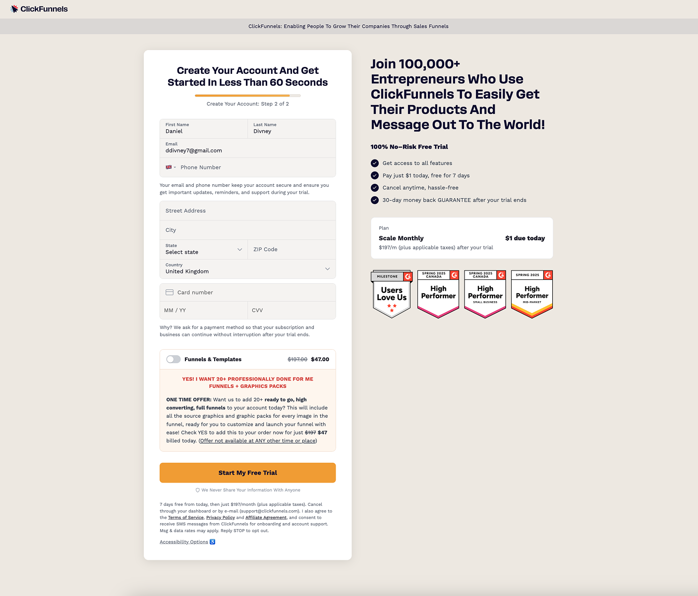
These were individually small improvements, but collectively they reduced visual noise, shortened the form, and removed moments of confusion. The floating labels and field grouping had the most noticeable impact on mobile where vertical space is at a premium.
Week 3: Address removal
What shipped:
- Removed full street address, city, and state fields
- Kept only country and postal code (sufficient for digital product billing verification)
- Moved country field above postal code so the system could conditionally show or hide the postal code field based on whether the selected country requires one
- Implemented as a JS/CSS override rather than an app-level change to the checkout component, since modifying the component itself would have affected all checkout instances across the product (including physical product checkouts for CF users)
The constraint: The checkout form was a shared component used both for CF's own trial signup and inside the application for CF users selling their own products. Marketing pushed back on changing the address fields because it would break physical product checkouts where a shipping address is genuinely needed. I used Stripe's approach as precedent: Stripe provides separate checkout configurations for digital and physical products. This argument won the team over to the idea of eventually separating the components permanently, but in the short term the JS/CSS workaround let us test the hypothesis without a risky architectural change.
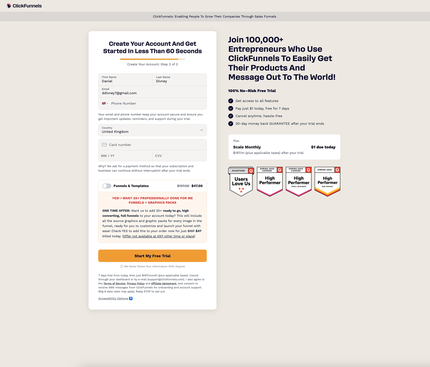
The address removal was a significant jump. Users no longer questioned why a full address was needed for a digital trial, and the form was visually shorter and less intimidating.
Week 4: 2FA removal (isolated test)
What shipped:
- Disabled the two-factor authentication auto-checkout flow for returning customers
- Returning customers now saw the same standard checkout form as new visitors
Why isolated: This was deliberately tested in isolation for two reasons. First, the engineering effort to modify the 2FA flow for all returning users was significant and needed data to justify the investment. Second, we wanted a clean read on whether this single change moved the needle, free from any confounding variables.
This was the single largest improvement in the entire project. The 2FA auto-checkout, originally designed to streamline the returning customer experience, was actively suppressing conversion. On mobile especially, the authentication interruption was causing users to abandon. Once removed, returning customer segments saw a dramatic improvement, while new visitor segments remained stable (confirming the change only affected the intended group).
This was also the most interesting finding from a research methodology perspective. The 2FA issue would never have been uncovered through usability testing alone, because test participants were new to the flow. It was only visible through quantitative segmentation (returning customers converting worse than new ones) and session recordings (seeing the 2FA flow in action). The data told us something the users couldn't.
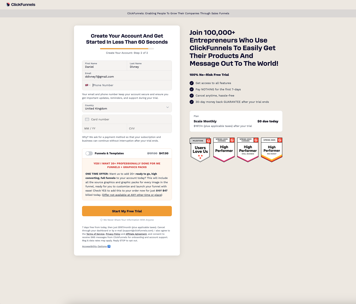
Week 5: $0 trial + microcopy
What shipped:
- Changed the trial from $1 to $0 (enabled by a Payments AI platform update that now allowed free trials)
- Added explanatory microcopy beneath the card fields: "Why? We ask for a payment method so that your subscription and business can continue without interruption after your trial ends."
The dependency: This change had been identified in week 1 usability testing but was blocked by a technical constraint. The Payments AI system required a minimum $1 charge for any trial. The platform team needed to release an update to support $0 trials before we could implement this change. This is why it was sequenced to week 5.
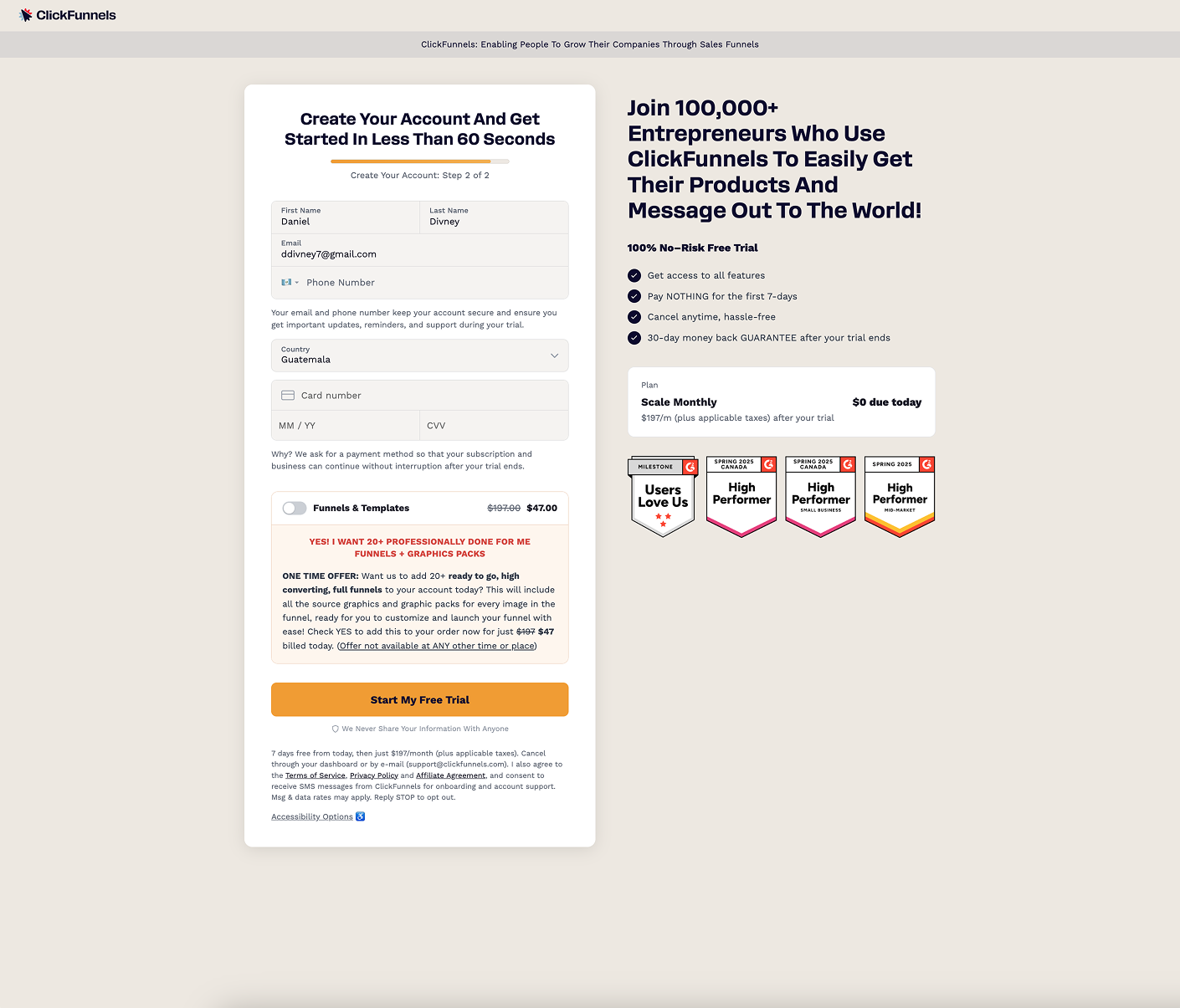
The combination of removing the confusing $1 charge and proactively explaining why a card was still needed addressed both usability testing insights simultaneously. Users no longer felt deceived by a "free" trial that charged them, and the microcopy preemptively answered the question "why do you need my card?"
Week 6: Final measurement & handoff
The final week was used for measurement stabilization and stakeholder presentation. The checkout completion rate settled at 38.6%, bringing CF's trial signup performance in line with the industry benchmark of 36%.
Image placeholder
Final checkout: original (23.4% completion) vs shipped (38.6% completion)
I documented all findings, research artifacts, and the prioritization framework, and handed ongoing optimization to the marketing team for continued copy A/B testing and iteration.
Summary of Results
| Week | What Shipped | Cumulative Result | Change vs Baseline |
|---|---|---|---|
| 1 | Research & discovery | 23.4% (baseline) | 0 pts |
| 2 | UX cleanup (prefill, floating labels, grouped fields, validation, country default, remove dividers) | 26.1% | +2.7 pts |
| 3 | Address removal (JS/CSS workaround), country/postal code logic | 29.8% | +6.4 pts |
| 4 | 2FA removal for returning customers (isolated test) | 33.5% | +10.1 pts |
| 5 | $0 trial + explanatory microcopy | 36.7% | +13.3 pts |
| 6 | Final measurement + handoff | 38.6% | +15.2 pts |
Systemic Impact
Beyond the checkout completion rate improvement, this project resulted in a permanent architectural change: the checkout component was split into separate digital and physical product variants. When a digital product was selected, the simplified checkout (country + postal code only) was used. When a physical product was selected, the full address form appeared. When both product types were in the same checkout, the physical product variant was used since the shipping address was needed regardless.
This change improved the checkout experience for all ClickFunnels users building funnels, not just CF's own trial signup page.
Reflection
What worked
Mixed methods gave the complete picture. The three research inputs (quantitative segmentation, session recordings, and usability testing) each surfaced issues the others couldn't. The biggest single win (2FA removal, +10.1 pts alone) came from data and session recordings. The mental model fixes ($0 trial, microcopy, address removal) came from usability testing. Neither approach alone would have found everything.
The weekly cadence enforced discipline. Shipping one change per week and measuring against baseline gave us clean data on what worked and by how much. It also maintained stakeholder confidence because they could see progress every Monday.
Pragmatic problem-solving unlocked progress. The JS/CSS workaround for address removal let us test the hypothesis without waiting for an architectural change. Reaching out to customers directly for usability testing bypassed the budget constraint. Sequencing the $0 change around the Payments AI dependency kept the project moving.
What I'd do differently
Test the week 2 changes more patiently. We grouped all the low-hanging fruit UX fixes into a single release, which meant we couldn't attribute the +2.7 point improvement to any specific change. Some of those fixes may have competed with each other. If we'd had more time, isolating even the minor changes would have given us more precise data on what drove the improvement.
Push harder on novel ideas. One concept I wanted to explore was showing a blurred overlay of the application behind the checkout form, so users could see what they were about to access but felt a sense of curiosity and urgency to complete the form to "unlock" it. This idea didn't make it into the sprint due to time constraints, but I believe it could have meaningfully impacted completion rates by shifting the user's mindset from "I'm filling out a form" to "I'm one step away from getting in."
Image placeholder
Concept sketch: blurred preview of the application behind the checkout form, framing it as 'one step away from getting in'